Artwork – Album éponyme des « Blood Red Shoes »
Aujourd’hui et pour parler du dernier visuel de l’album éponyme des Blood Red Shoes (et grâce aux indications de Steve Ansell, chant et batterie), j’ai eu l’occasion de poser quelques questions à Chris White de We Three Club, un duo artistique à l’origine des derniers visuels du groupe.
Today and to talk about the last Blood Red Shoes‘ record (thanks to Steven Ansell, drums and lead singer of the band), I had the opportunity to ask a few questions to Chris White from We Three Club, artistic duet behind the last BRS’ artworks.
WeThreeClub est l’association artistique et personnelle de Chris et Alex White, mari et femme dans la vie. Basé à Cambridge, leur studio est spécialisé dans le print et notamment la musique. J’ai ainsi eu l’extrême privilége de pouvoir poser quelques questions à Chris et afin d’en faire profiter un maximum de personnes, pour la première fois, je mets à disposition l’interview en français et en anglais !
WeThreeClub is the artistic and personal association of Chris and Alex White, man and wife. Based in Cambridge, their studio is specialized in print designs (silkscreen printing) and music. I had the extreme privilege to ask a few questions to Chris and decided to provide maximum exposure, for the first time, I’m putting it in french and in english !
Tout d’abord, comment vous êtes-vous retrouvés à travailler avec les Blood Red Shoes ?
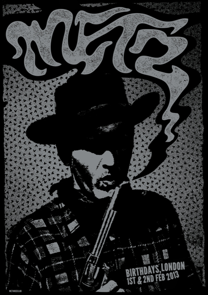
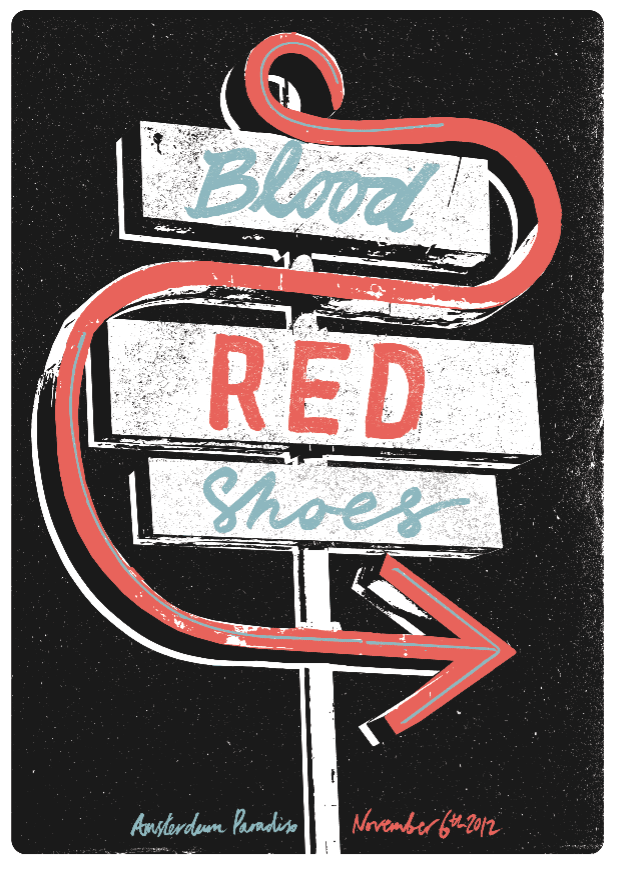
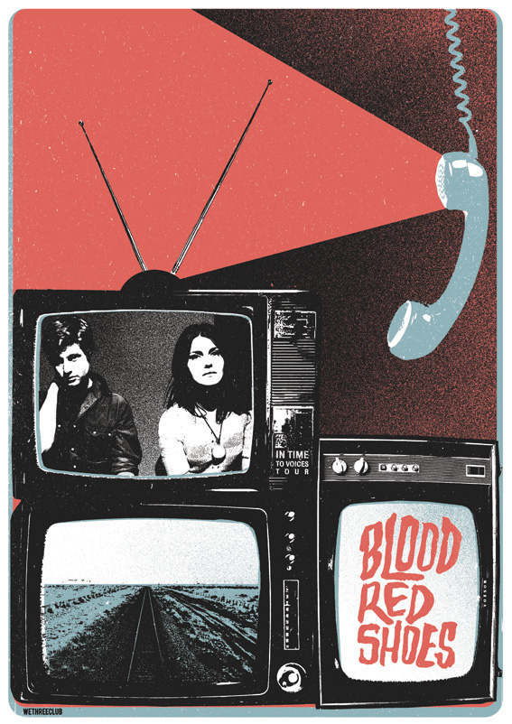
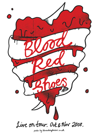
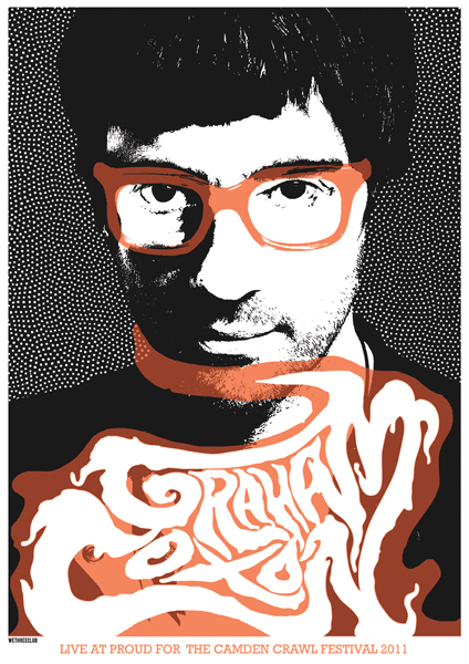
À vrai dire, je connais Laura-Mary (guitariste du duo rock) via des amis mutuels depuis près de 15 ans maintenant puisque nous avons grandi dans le même coin… Mais ça ne s’est pas fait avant 2008 alors que je réalisais une affiche appelée « Flatstock » pour le Festival Reeperban d’Hambourg quand j’ai travaillé pour eux la première fois. En tant qu’artiste exposant, il nous était demandé de créer une sérigraphie au format poster pour un des groupes présents et j’ai choisi les BRS.
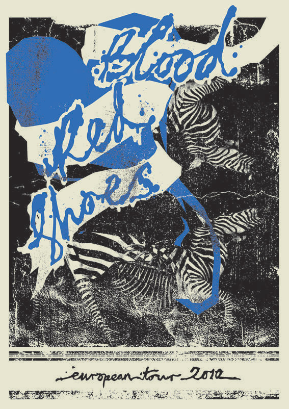
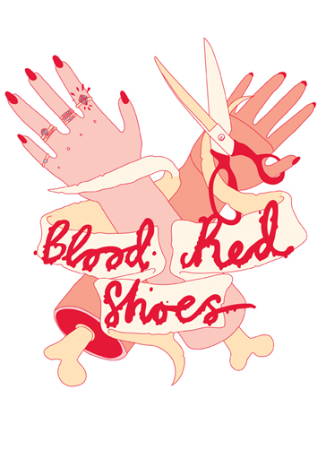
Il s’est avéré qu’ils ont vraiment apprécié la composition et que cela a fini par être réimprimé avant de devenir l’affiche de leur tournée européenne 2008. Ce qui a mené à une affiche en 2010 pour « Fire Like This » et à nouveau pour la tournée « In Time To Voices » en 2012 ainsi que d’autres affiches pour des dates isolées au cours de la tournée. Quand Alex et moi avons démarré WeThreeClub, ce T-shirt des BRS fut en fait la première chose sur laquelle nous ayons bossé ensemble. C’est vraiment super de bosser avec ce groupe puisque Laura-Mary est une artiste elle-même et je pense que l’on se comprend vraiment mutuellement dès qu’il s’agit de direction artistique.
How did you get yourselves involved working with the Blood Red Shoes in the first place ?
I’ve actually known Laura-Mary through mutual friends for nearly 15 years now, as we both grew up in the same area… But it wasn’t until 2008 when I was doing a poster show called « Flatstock » at the Reeperbahn Festival, Hamburg when I first did some work for them. As an exhibiting artist at Flatstock, we were asked to create a screenprinted poster for one of the acts playing, and I chose BRS.
It turned out that really they liked the design and it actually ended up getting re-printed and becoming their European Tour print for 2008, which then led onto a tour print in 2010 for « Fire Like this » and again for « In Time To Voices » Tour in 2012 (also various one off show ones along the way). When Alex and I started WeThreeClub, this BRS tee was actually the first thing we worked together on. They are a really great band to work with as Laura Mary is an artist herself and I think we really understand one another when it comes to the art direction.
Quelle fut l’idée principale pour la couverture de ce nouvel album ?
J’ai revu Laura-Mary et Steve dans un pub et on a juste discuté de ce à quoi ressemblait l’album, le processus d’enregistrement, de la « vibe » générale, de l’ambiance et comment ils voyaient la perception de cet album.
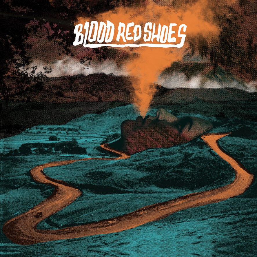
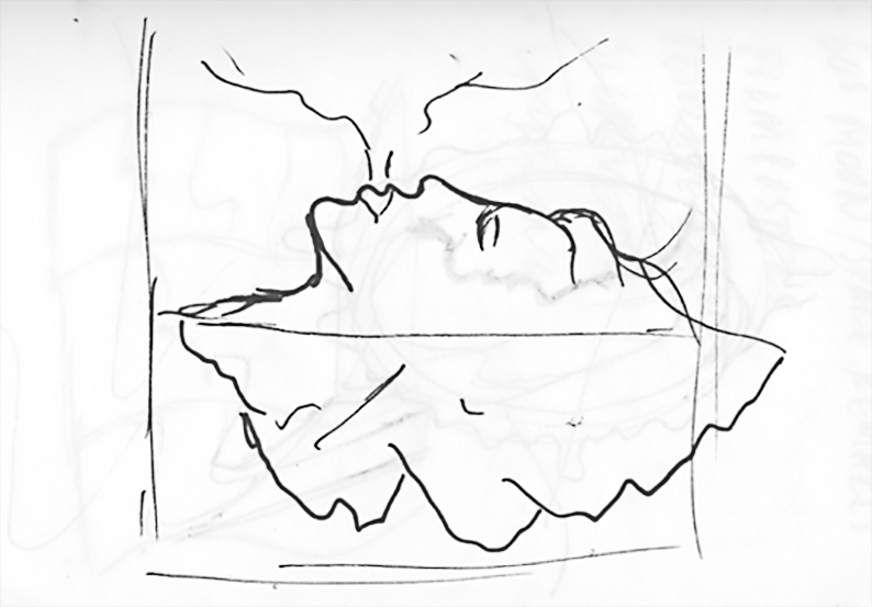
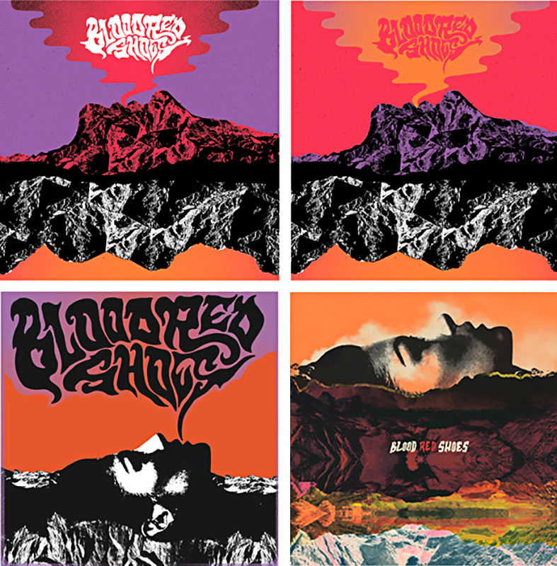
J’ai écouté certains titres non masterisés et j’ai été immédiatement inspiré… Une des idées dont nous avons discutée concernait le profil d’un visage de femme expirant de la fumée dans laquelle on pourrait lire le nom du groupe et l’arrière de sa tête se réfléchissant en un paysage montagneux (Chris ayant été suffisamment sympa pour nous faire profiter de cette esquisse).
Laura-Mary m’avait déjà envoyé beaucoup d’images références, une sorte de planche tendance graphique. Montagnes, fumée et paysages y figuraient déjà pas mal, il était donc évident que nous voulions en quelque sorte créer un univers d’un bout à l’autre de l’artwork, en collant et superposant différents décors et paysages.
What was the main idea for this new LP cover ?
So I met up with Laura-Mary and Steve in a pub and we just chatted about what the record was like, the recording process and the general vibe and mood and how they saw it being perceived.
I listened to some of the unmastered tracks and was really instantly inspired. One of the ideas we discussed was the profile of a woman’s face blowing smoke, with perhaps the band name written in the smoke, and the back of her head being mirrored as a mountainscape (Chris was kind enough to give us this exclusive insight).
Laura-Mary had already sent me over a lot of reference pics, a kind of mood board. Mountains, smoke and landscapes featured heavily, so it was clear we wanted to sort of create a world throughout all the artwork, with collaging and layering different scenes and landscapes.
Comment s’est passée ta collaboration avec Laura-Mary et comment l’as-tu gérée dans ton propre flux de travail ?
Je suppose que c’était une collaboration dans le sens où Laura-Mary m’avait envoyé diverses sources d’inspiration, mais après ça, j’ai dû esquisser des idées. Nous avons originellement assemblé l’artwork mais Laura et Steve avaient une véritable connexion avec ce qu’ils avaient imaginé. Il y a eu un certain nombre de révisions afin d’en arriver là. Quand nous avons décidé d’utiliser la photo d’un visage féminin, Laura-Mary a pris quelques photos de sa soeur et nous avons fini par les utiliser, ce n’est donc PAS Laura-Mary sur la couverture au cas vous auriez pu le penser !
* Chris nous offre un autre aperçu du process de créa :
« Vous pouvez voir quelques unes des idées de base qui ont permises d’aboutir au résultat final, les choses devenaient un peu trop abstraites et psychédéliques et nous avons retravaillé ça dans un style classique sombre. »
How went your collaboration with Laura-Mary and how did you manage this collaboration in your own workflow ?
I guess It was a collaboration in the sense that Laura-Mary had sent me things to be inspired by, but after that I just got down to drawing up ideas. All artwork was originally put together by ourselves but Laura and Steve had a huge connection with what they envisioned. There was a number of revisions to get it where it ended up. When we decided on using a photograph for the female portrait, Laura-Mary took some photos of her sister and we ended up using them, so its not Laura-Mary on the cover, in case anyone thought that !
* Another glimpse of the process, Chris gave us :
« You can see some of the rough cover ideas that we went through to get to the final design, things were getting a bit too abstract and psychedelic and we reigned it in for a more dark classic style. »
Comment établis-tu un lien entre ton travail et ta musique ? Écoutes-tu l’album ou n’est-ce pas forcément nécessaire te concernant ?
Je pense que c’est important d’avoir un ressenti de musical et évidemment que l’artwork en soit le reflet, même si parfois il n’est pas possible d’entendre le tout avant que le groupe n’ait déjà besoin de l’artwork ! Heureusement avec cet album, j’ai pu avoir un aperçu des titres et avec un peu de chance, cela colle avec le ton du disque !
How did you connect your work to the music ? Did you listen to the record or is it something that isn’t always necessary to you ?
I think it’s important to get a feel of the music and obviously you want the artwork to reflect the music, although sometimes it’s not possible to hear it all before the band need the artwork ready! Luckily with this album I was able to have a preview of the tracks and hopefully it fits the mood of the record !
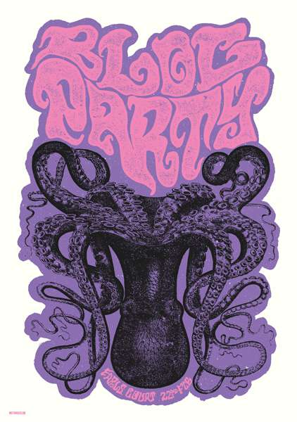
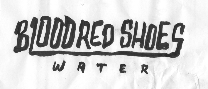
J’aime vraiment aimé ce que vous avez fait sur l’EP « Water » et sur votre site, il y a cette affiche pour le plus gros concert qu’ait assuré le groupe en tête d’affiche, on peut y lire que vous vouliez en faire un « compagnon visuel pour l’EP, presque comme une autre scène tirée d’un même film. » Est-ce quelque chose que vous faites souvent ? Penser votre travail comme un film potentiel ou l’avez-vous tout particulièrement pour cette affiche ?
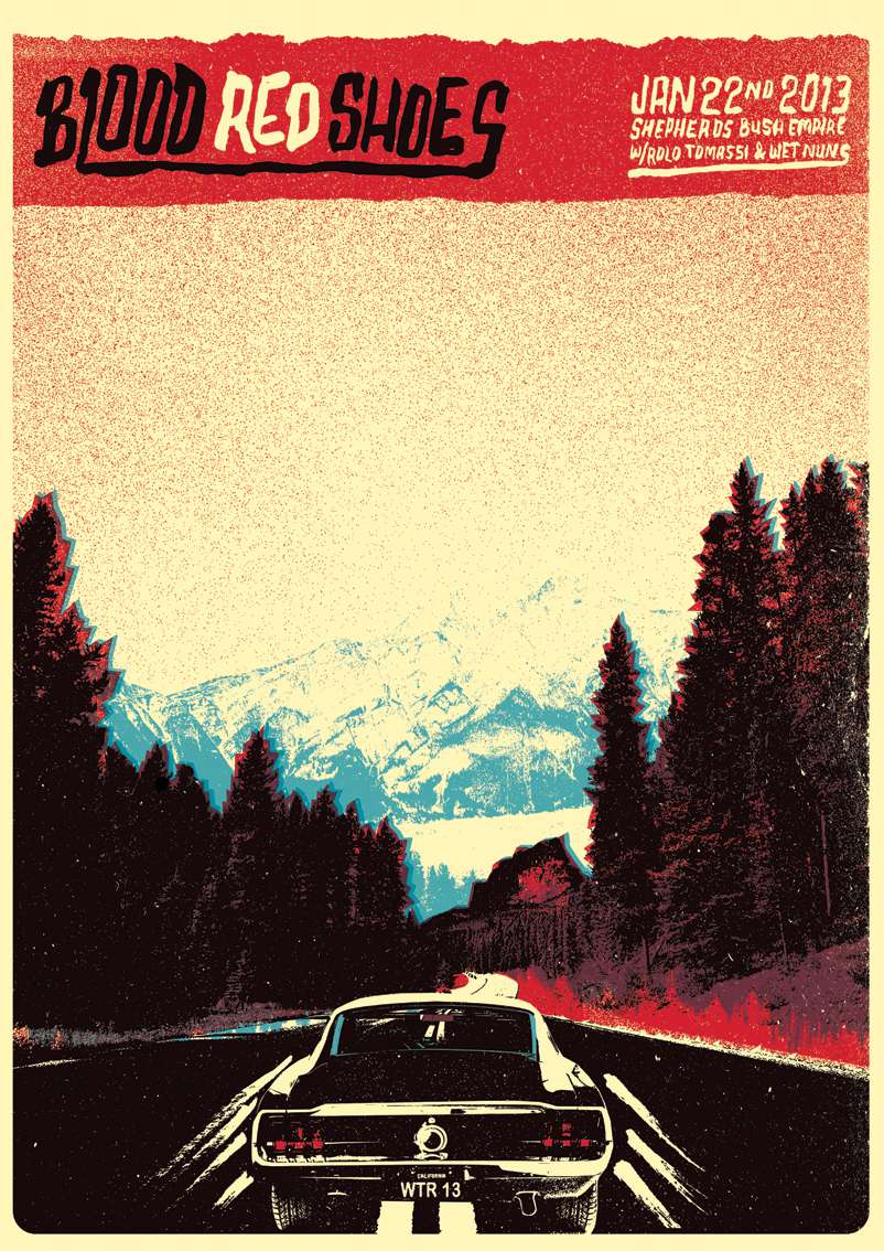
Merci, oui l’EP « Water » était vraiment fun à faire, c’est tombé quand le groupe tournait aux States et que Laura-Mary n’aurait clairement pas le temps de dessiner la couverture (elle a réalisé toutes leurs couv’ et artworks par le passé). J’étais vraiment honoré qu’elle me fasse confiance pour bosser dessus. Elle est venue à moi avec une idée bien précise d’une main émergeant d’un lac et était vraiment dans l’idée d’en faire un truc proche de la 3D. Une force narrative semblait s’en dégager et quand il a fallu faire un poster pour le show du Shepherds Bush, j’ai pensé que ce serait fun de faire une autre scène basée sur cette même histoire.
Concernant les thèmes récurrents au fil de nos projets, c’est clairement quelque chose que j’aime faire. Avec ce 4e album, c’était génial de pouvoir se perdre dans ce monde que nous avions créé. Vous verrez bientôt le single « An Animal » et les singles suivants qui seront dans le même registre y compris niveau merchandising qui s’attache à reprendre des thèmes de l’artwork et de la musique.
I really love what you did on their « Water » EP, on your website, there’s this poster for their biggest headline show and you said that you wanted it « to be a companion piece to it, almost like another scene from the same film ». Is it something you often do ? Did you do this on this particular poster or is it something you used to do in your work ?
Thanks, yeah the Water ep was really fun to do, that came about when the band were on tour in the states and LM wasn’t going to have the time to draw the cover (she had done all their covers and artwork before). I was really honoured that she trusted me to work on it. She came to me with a pretty clear idea of a hand coming out of a lake and was really into it looking kind of 3d.. So we just ran with the idea. It seemed to have quite a strong narrative, and when it came to doing a gig poster for the show at shepherds bush I thought it would be fun to do another scene from the same story.
Regarding a running theme through projects, it’s a certainly something I enjoy doing. With this S/T 4th album, it was amazing to get lost in the world we created. You will soon see that ‘An Animal’ and the follow up singles will all fit in with it as well. Including merchandise designs tying in with some of the themes in the album artwork and in the music.


Quelles sont tes principales influences en tant qu’artiste ?
Je suis influencé par toutes sortes de choses, mes contemporains, le pop art, la musique, les brocantes, la nature, les films. On ne peut jamais deviner ce qui va servir d’étincelle pour une future idée.
What are your mains influences as an artist ?
I’m influenced by all sorts of things, my contemporaries, pop art, music, junk shops, nature, film. You never know what is going to spark an idea.
Quelles techniques utilises-tu et pourquoi ? Comment vois-tu l’utilisation massive des ordi’ et softwares comme Illustrator et Photoshop dans la création graphique contemporaine ?
En fonction de ce que je fais et de ce dont j’ai besoin, je travaille généralement avec des images trouvées, des visuels que je me réapproprie et des dessins au crayon. Ensuite je vais couper dans tout ça et faire l’assemblage sur ordinateur.
Pour cet album, j’ai passé pas mal de temps à chercher dans les magasins d’antiquité et brocantes de vieilles cartes postales et des photos de paysages afin de créer un nouveau monde et horizons, c’était vraiment fun.
Which technics do you use and why ? How do you see the important use of computers or softwares like Illustrator and Photoshop in graphic design nowadays ?
Depending on what I’m doing and what is needed, I generally work with found images, re appropriated graphics, and hand drawn elements. Then I will cut it all up and put it all back together on the computer.
For this record I spent a long time scouring antique and junk shops finding old postcards and nature photos to cut up and create a new world and landscape, it was really fun.
Quels sont les éléments qui caractérisent le plus ton travail ?
Je suppose que mon texte manuscrit est la partie la plus reconnaissable de mon travail mais je suis assez heureux d’essayer de nouvelles choses et je ne veux pas être rattaché à un style particulier. Je pense qu’il est important de repousser ses propres limites et de s’assurer que l’on progresse en tant qu’artiste.
What is the most recognizable part of your work ?
I guess my handwriting is a recognizable part of my work, but I’m quite happy trying new things out and don’t want to be tied down to a particular style. I think it’s important to constantly push yourself and make sure you are progressing as an artist.
Pour quel groupe aimerais-tu travailler ?
J’adorerais faire quelque chose pour Morrissey et Les Savy Fav.
Which band would you love to work with ?
I’d love to do some work for Morrissey and Les Savy Fav.
Dernière question, quel conseil donnerais-tu à un graphiste qui souhaiterait se lancer dans le business musical comme toi ?
Travaille dur, sois sympa et valorise bien ton travail.
Last one, which advice would you give to a graphic designer who would work in music business like you do ?
Work very hard, be nice and value your work.